Simple signs: The Ranger rants on a ferry
- Complaining about the Mainland - 17th August, 2024
- New island designation – is it just greenwash? - 26th April, 2024
- Police and Crime Commissioners – a solution or a problem? - 21st April, 2024
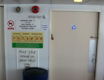
A topic which has been on The Ranger’s mind at work recently is signage, and how best to erect notices to indicate country parks, nature reserves and other sites. Before you even erect it, a sign needs to have a clear purpose and a prospect of success in communicating its message. There are at least two important priorities for most signs at park entrances – firstly, to get over the message that this is a special place, with a name, in which you can expect and do certain things; and secondly, that it is run by some organisation, which not only pays for the signs but probably has its own set of corporate design standards. Whilst achieving these two objectives it is important not to spoil the historic landscape and natural beauty which the visitors may have come to admire. A tricky set of priorities to balance out. The basic problem is how to communicate what is potentially a lot of information, some of it conflicting. The answer, in short, is to keep it simple, stupid. But that’s harder than it might seem. Here’s a case study to show what happens when you don’t achieve that simplicity of signage. On a recent trip to the mainland The Ranger was sat on the ferry pondering signs when he was struck by the barrage of signage on a wall in the passenger lounge. It was a dull crossing so he was feeling pedantic – be warned. Here is an overview:

Don’t worry, more detail follows. Just check out the whole display. The Ranger counts nine different signs (there are two really tiny ones under the alarms), one of which is an advertisement, partly obscured by the bin. What is the main message you read from this confusing mish-mash? That’s right: “Our coffee will make you fart“. The rest is pretty much lost. But what were they trying to say? Let’s look further:

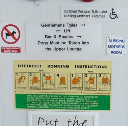
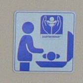
Yes, there’s quite a lot there that could be analysed, but concentrate on what might perhaps be the most important safety message – the lifejacket instructions. Apart from being almost the smallest text there, it’s fairly clear, but it ought to be pointed out that this sign includes the words ‘this is a muster station’. Actually, the on-board recorded safety announcements which every voyage is cursed by make it perfectly clear where the muster stations are – and they are not here. So here’s one important lesson: get your facts right, and make sure all signs are consistent. The next issue concerns the function of the door to the right of the signs. What’s behind it? Two signs say it is a ‘Nursing mothers room‘ or ‘Nursing mothers facilities‘, but it also might be ‘Disabled Persons Toilet‘, ‘Gentlemens Toilet‘, or possibly even ‘Bar & Snacks‘. There are just too many signs here to be sure. What’s more, except for the more-or-less redundant disabled logo all of these signs would be fairly incomprehensible to anyone who couldn’t read English. Luckily there is a sign on the door itself:

Hmm… that really doesn’t clarify matters much. Is it a bomb-disposal facility? A laptop-charging station? A chapel of rest? Probably something to do with Pokemon. Oh, enough. Surely, any more is just too much. There are plenty of excellent examples of signs which communicate these messages much more simply. This is the best lesson to learn from this example: less signage is more. So, will these lessons be drawn out to inform decisions about country park signage? The Ranger will keep you informed in future posts: meanwhile, if you have any examples good or bad, feel free to suggest them below.

There’s quite a bit of legislation – although perhaps not as much as some would like! I think you’re probably right about most of it -it appears to be reactive rather than proactive. Although I don’t think there’s any statutory requirement to have a sign for the cafe..
Do you have a lot of legislation or regulations in the UK that require this type of signage? They may just be putting it there to get it over with, so to speak. Slap up the signage and fulfill their obligations.
I do like the picture with the body in the open casket. Pehaps they hold wakes in that room. More importantly, won’t the little tykes get nauseous from the bathroom smell when their mothers are feeding them in there?